Rebranding is often seen as a way to modernize a company, attract new audiences, and stay relevant in changing markets. But when companies underestimate the emotional connection customers have with their brands, even well-intentioned redesigns can quickly turn into public relations disasters.
From logo overhauls and packaging redesigns to complete identity transformations, some of the world's biggest brands have learned that changing a familiar image can come at a significant cost. Here are ten notable rebranding failures and the lessons businesses can learn from them.
1. Cracker Barrel (2025)
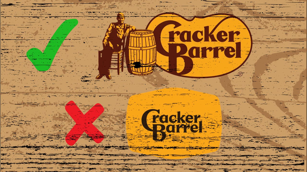
One of the most recent examples involved Cracker Barrel, which attempted to modernize its image through a new logo, updated interiors, and a broader brand refresh. Customers accused the company of abandoning the nostalgic country-store identity that made the brand unique. Following widespread backlash, the company reversed many of the changes and restored elements of its traditional branding.
Lesson:
Heritage brands must carefully balance modernization with the emotional connections customers have built over decades.
2. Gap (2010)
Gap’s logo redesign remains one of the most famous branding failures in modern marketing history. The retailer replaced its iconic blue-box logo with a minimalist Helvetica design. Social media criticism was immediate and overwhelming, forcing Gap to abandon the new logo just six days later.
Lesson:
Never underestimate the value of visual familiarity and customer attachment.
3. Tropicana (2009)
PepsiCo spent millions redesigning Tropicana’s packaging, replacing the iconic orange-with-a-straw image with a cleaner, modern look. Customers struggled to recognize the product on store shelves, leading to a sharp decline in sales. The company quickly reverted to the original design.
Lesson:
Packaging is often a brand’s most powerful identifier. Change it carefully.
4. Jaguar (2025)
Jaguar’s controversial repositioning strategy generated significant debate among consumers and automotive enthusiasts. Critics argued that the company distanced itself too far from the performance-oriented heritage that defined the brand for generations.
Lesson:
Innovation should enhance a brand’s identity, not erase it.
5. RadioShack’s “The Shack” Campaign (2009)
In an effort to appeal to younger consumers, RadioShack attempted to shorten its name to “The Shack.” The change failed to resonate with customers and became symbolic of the retailer’s broader struggles rather than a successful transformation.
Lesson:
A new name alone cannot solve deeper business challenges.
6. Weight Watchers Becomes WW (2018)
Weight Watchers rebranded as WW to emphasize wellness rather than weight loss. While the strategy had a clear purpose, many consumers struggled to understand what the new name represented, creating confusion around the company’s identity.
Lesson:
Customers need a clear explanation of why a rebrand is happening.
7. Mastercard’s Three-Circle Experiment
Mastercard briefly experimented with modifying its iconic overlapping red-and-yellow circles by adding an additional graphic element. The redesign complicated one of the world's most recognizable logos and was eventually abandoned.
Lesson:
Simplicity often wins when dealing with globally recognized symbols.
8. JCPenney’s Reinvention Effort
The retailer attempted a broad transformation that included changing pricing strategies, store presentation, and branding. Longtime customers rejected the changes, contributing to declining sales and forcing management to reverse course.
Lesson:
Know who your core customers are before pursuing dramatic change.
9. X (Formerly Twitter)
The decision to replace the globally recognized Twitter brand with “X” generated widespread debate. While the platform sought to signal a broader vision, many users questioned the value of abandoning one of the strongest brand names in technology.
Lesson:
Brand equity built over years can be difficult to replace overnight.
10. Yahoo’s Frequent Logo Changes
Yahoo experimented with multiple logo updates over the years, often generating little enthusiasm among users. Frequent changes created inconsistency and made it harder for the company to establish a stable identity during a period of intense competition.
Lesson:
Constant change can dilute rather than strengthen a brand.
Common Mistakes Behind Failed Rebrands
Despite their differences, most unsuccessful rebrands share several common themes:
- Removing iconic visual elements customers recognize
- Ignoring brand heritage and nostalgia
- Failing to communicate the purpose of the change
- Prioritizing trends over identity
- Attempting to solve business problems through design alone
- Launching major changes without sufficient customer testing
What Successful Rebrands Do Differently
The most successful rebrands evolve rather than replace a brand’s identity. They preserve familiar elements, involve customer feedback, clearly explain the reasons for change, and align visual updates with meaningful business improvements.
As the Cracker Barrel, Gap, and Tropicana examples demonstrate, customers often feel a sense of ownership over the brands they love. When companies fail to respect that relationship, even the most expensive rebranding campaigns can quickly become cautionary tales for marketers everywhere.